
 2 hours ago
2
2 hours ago
2

Welcome back to another Marvel Rundown! In this edition of our weekly Marvel review column, we spotlight the new Planet She-Hulk series from Stephanie Phillips and Aaron Kuder. But that’s not all, stick around for our regular Rapid Rundown for reviews of Alien vs. Captain America, Amazing Spider-Man, and dispatches from the Age of Revelation including Amazing X-Men, and Longshots!
As always, The Beat wants to hear from you, True Believers! Tell us what you think of this week’s Marvel Comics! Shout us out in the comment section below or over on social media @comicsbeat, or @comicsbeat.bsky.social, and let us know.
 Planet She-Hulk #1
 Planet She-Hulk #1
Writer: Stephanie Phillips
Artist: Aaron Kuder
Colorist: Sonia Oback
Letters: VC’s Joe Caramagna
I’ve been looking forward to Planet She-Hulk since we got a glimpse at the potential (She-Hulk in space with a giant sword) in the first issue of Imperial. The fish out of water aspect proved its entertainment potential in the special Imperial one-shot earlier this year. I’m a big fan of classic Jen Walters, single female lawyer, but I welcome a new, bold take that puts the character in different situations she is seemingly ill-equipped to handle. Lord knows we at this column have been begging Marvel to take more chances like this. The script by Stephanie Phillips is a bit more serious than in her previous stellar Imperial story but it is no less enjoyable.
The things that makes Jen such a great character are her indomitable spirit and self-assuredness. It’s a stark contrast to the many brooding tragic heroes in the Marvel stable. It shines through on the planet Sakaar, where she is thrown into a politics of violence and physical strength that seemingly opposes her natural abilities—her wit and legal mind. Instead of getting beaten down by it, though, Jen is just exasperated and ready to go home. She knows what it takes to be regent of Sakaar and she wants no part of that side of her family history—the brutish power and violence. To that end, this first issue’s set up revolves around She-Hulk smashing aliens into submission and trying to negotiate and flirt her way into a spaceship to make her way home. By book’s end, she may wind up a detective on top of regent and lawyer.
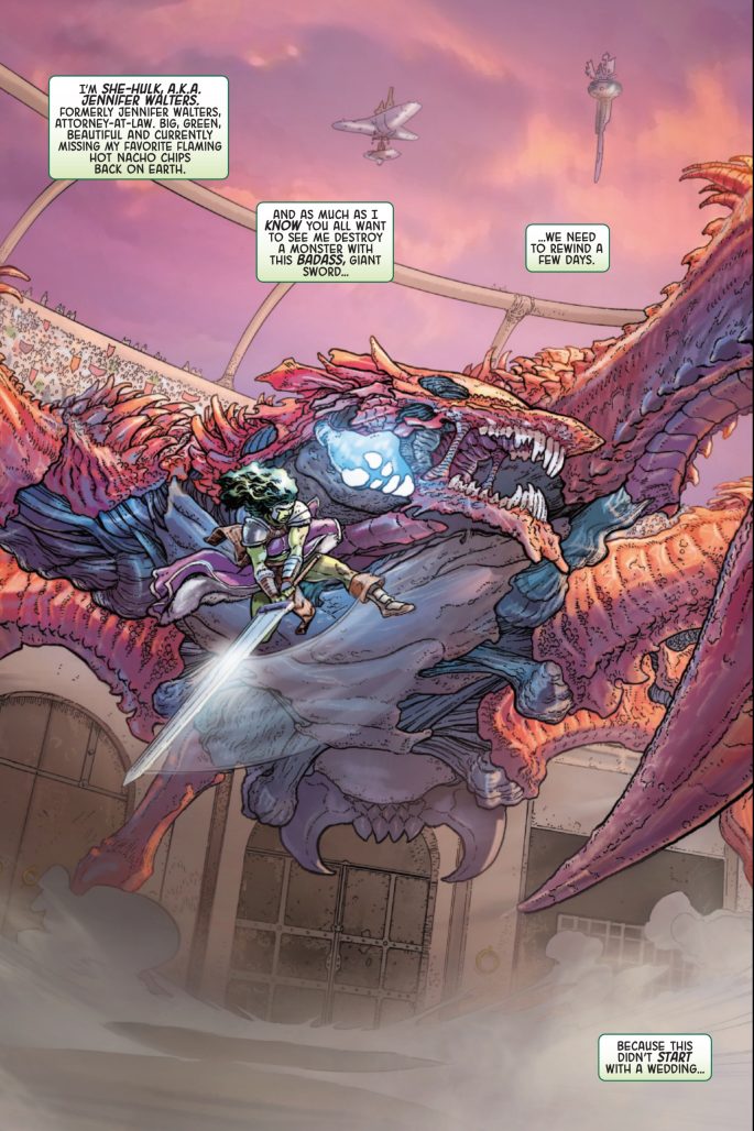
Aaron Kuder’s art is well suited for the big beefy characters and spectacle of Sakaar. There are plenty of double page spreads of action but he also finds the drama and storytelling moments in quieter beats, like She-Hulk splashing into a massive tub for a brief moment of relaxation after days of nonstop politicking and fighting. He builds the tension with tight panels focused in on small details of She-Hulk coming home and making her way to the tub before a quarter page image of her falling into the water, punctuated by a vertical panel shaped like a SPLASH. The moment is then quickly cut short in a final vertical image with a word balloon from off the page. The visual storytelling is top notch throughout. Unsurprisingly, Kuder shines in the moments of big action. Overlapping panels emphasize weight and speed, balanced by a massive image of She-Hulk leaping through the air, frozen in time and building momentum, or the roar of an angry wedding beast.
The art, with its thin lines and harsh angles is not as well suited for the humor peppered throughout Phillips’ script. He isn’t quite able to stretch the facial expressions or resist the urge to make a cool image when a more goofy moment might be called for. It doesn’t detract from the end product though, as Phillips mostly plays things straight here.
![]()
Sonia Oback approaches the colors with an Earthen, muddled, palette. Sakaar is a brutalist civilization with brown and tan stone and dirt as far as the eye can see. They are a hard people who live off the land and there is nothing flashy about the color. She-Hulk’s green skin pops in contrast to the grimy surroundings. VC’s Joe Caramagna takes on lettering duties and his steady hand moves readers effortlessly through Kuder’s looser layouts with ease, dancing around panel inserts and backgrounds. The SFX also stand out. This is a She-Hulk book, after all, so Phillips leans into the whimsy in her script, giving us plenty of onomatopoeia to enjoy and allowing Caramagna to have fun squelching and slashing.

Planet She-Hulk is a refreshingly fun comic that is blessedly different from any of Marvel’s other offerings. It is fun without being overly silly but most importantly, it puts a character in new situations that challenges her in new ways. I didn’t know I needed space She-Hulk with a giant sword until it was presented to me and now I can’t imagine why it took so long to get here. More of this kind of storytelling, Marvel! Give us the unexpected and different.
Verdict: BUY!
The Rapid Rundown
- Alien vs. Captain America #1
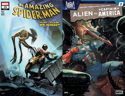
- As soon as Marvel got the comics license back for Alien and Predator, they have put both franchises to work. Mostly this has been through numerous crossovers with Marvel heroes. The last year or two has seen both franchises go up against the likes of Wolverine, Spider-Man, and a future where the Avengers are left to fight a losing war against the xenomorphs. After the ambitious Alien vs. Avengers, we now get the very meat and potatoes Alien vs. Captain America. The only surprise in the script by Frank Tieri lies in its setting. This is World War II Cap with Bucky as his sidekick and teaming up with the Howling Commandos. Hydra finds an ancient cache of face hugger eggs and what you expect ensues. A premise like this should be a way more fun to read than this first issue is. Even if the title says Alien, this takes after its sequel Aliens. Trieri seems to misunderstand what makes any Alien story really work. There’s always a sense of discovery in there of the horrible and unknowable and that lacks here. There is a lot of focus on action and less on mood or high minded science fiction. Yet the early scenes of Aliens have mood and tension as the Colonial Marines investigate what happened to the colonists at Hadley’s Hope. There’s so little build up or confidence to build towards horror on the comics page here. Artist Stefano Raffaele and colorist Neeraj Menon do try their best to put that in here. Raffale has a good sense of when to hit hard on the horrific like when a Hydra agent uses red skull gas on himself or the birth of a chestburster. It’s a shame that they’re just stuck in a story that’s too much in a hurry to get to the fun stuff. -DM
- Amazing Spider-Man #15
- I’ve been harsh on this latest Amazing Spider-Man run, but Amazing Spider-Man #15 has at least made my view on the series more positive. From Peter’s characterization and interesting character arc, thanks to the writer Joe Kelly, to the great art by guest artist Emilio Laiso, I found this issue of Amazing Spider-Man much more fun to read. The issue focuses on Peter and Rocket’s relationship while giving readers a grand reveal about Peter’s new suit and letting him fight a giant Star Wars-esque space monster. It’s hard not to like a majority of the issue, and it warmed me up to the idea of Peter in space, especially as he recognizes that being in space really is no different than being in New York in terms of the type of villains he meets. And maybe now that we’ve stuck with it for a bit, or perhaps I really enjoy Laiso’s art, I’m really digging the new black-and-yellow suit.My only issue with the issue is the ending. It heavily involves some of the new side characters —Xanto’s test subjects —who are still not very interesting. Kelly makes a creative choice with Raelith the Wretched, which is bound to upset many fans, and while it doesn’t bother me, it did make me roll my eyes. It feels like such an unnecessary point of drama and makes her already uninteresting character more uninspired. Kelly doesn’t seem to be doing anything of interest with these new allies, yet. But that can change in the future. I’m more excited for the future of Amazing Spider-Man, but I can’t help but feel weary that at any point the series can take a turn for the worse with these new characters. Hopefully it keeps this quality up. -LM
Dispatches from the Age of Revelation!
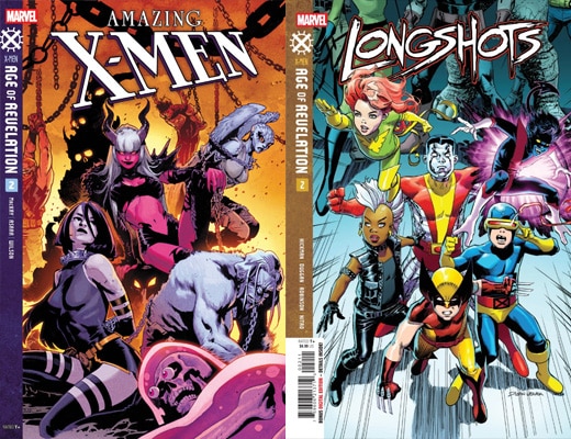
- Amazing X-Men #2
- Cyclops and Beast’s journey into the Age of Revelation continues into the Limbo Lands ruled by the Darkchild and Juggernaut in Amazing X-Men #2. Writer Jed Mackay’s central Age of Revelation plot is starting to take shape in this issue as the true nature of Cyclops and Beast mental transport to the future is revealed and confirms my own personal theory about it. This isn’t a true reverse Days of Future Past. Instead, it’s a full-on body swap as the future Cyclops and Beast have gone to the past to prevent Revelation’s ascent. As for the individual issue itself, it is appropriately titled A Duel of Truths as Cyclops and the Darkchild duel with harsh truths to gain sage passage. Mackay continues to build on Cyclops as a character who is unshaken by his past and doesn’t let the truth hurt him. It reminds me of the Judgement of Cyclops during the AXE: Judgement Day event from a few years back. It is the very definition of a talking heads issue, but Mahmud Arsar art talents elevate it to something much more. The notion of a Duel of Truths is a difficult one to convey visually, but body language and page composition helps sell the impact of these harsh truths. I am enjoying this series and the event as a whole despite my apprehensions. I am eager to see if it sticks the landing. –JJ
- Longshots #2
- The most bizarre of the Age of Revelation tie-ins continue with Longshots #2. The premise of the series, being a sort of Suicide Squad meets Mojovision pays off this issue as the ragtag team of villains and heroes run into a meat grinder at The Power Plant. Writers Jonathan Hickman and Gerry Dugan deliver an issue even more full of meta-commentary of event comics and reality tv than the last. The jokes land a lot better with this issue with the quips and asides just being more effective and less referential. The visual gags are sharper as exemplified by Galactus merch scene. Artist Alan Robinson does a great job with the gags and action sequences. The emotional core of the book is Wonder Man and Hellcat and Robinson gives the characters the emotional heft to make those moments resonate in the sea of silly. The way Robinson is able to render the X-Babies to look like kids and not small adults is fantastic and makes their gags much more impactful. While I liked the first issue, I was left a bit cold by it. However, Longshots #2 is more what I expected from this creative team, and I found myself chuckling along. What bearing the revelation of the issue will have on the Age of Revelation remains to be seen, but I am eager to see how it will play out. –JJ
 English (US)