
.jpg) 6 hours ago
3
6 hours ago
3
Parmigiani Fleurier CEO Guido Terreni shares his unique vision and the design philosophy shaping the brand’s timeless aesthetic.
Watches need to be relevant to their intended audience; otherwise, they are just exercises in vanity for both makers and buyers. If that happens to any brand, its future will be short because it will fall out of favour when the fickle tides of trends change. The most effective leaders in watchmaking understand that Guido Terreni gets it.
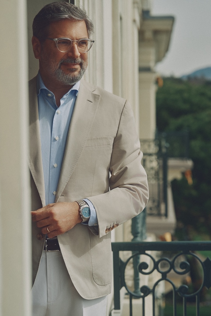
As a brief recap, Terreni arrived at the Fleurier brand to take on the CEO role in 2021 and immediately did the impossible: reinvigorating the brand with a new collection that fundamentally changed the watch world’s perceptions. The Tonda PF was a winner right out of the gate. More than this, Terreni managed this feat while the world was still locked in a devastating struggle with a pandemic. We continue to be amazed by this bona fide achievement. In many ways, the Tonda PF collection will forever be marked by the manner of its creation and its debut.
Admittedly, all this makes for a dramatic story, but Terreni is not an ultra-charismatic superhero, nor is he the recipient of unbelievable good fortune. To be fair, the man himself acknowledged that he was lucky in a way, because the manufacturer had everything in place for him to very quickly put his vision into motion. Not only does Parmigiani Fleurier have the ability to make movements, thanks to the Vaucher manufacture, but it also has a casemaker and dial maker in the mix. Terreni knew that with all this manufacturing power in place, he could get a lot done in a short time. The Milan native also had one other ace: Parmigiani Fleurier founder Michel Parmigiani, one of the living greats of contemporary watchmaking.
Terreni has always been clear that the spirit of Parmigiani Fleurier is bound up in the person of Michel, or rather, his mind and sensibilities. Terreni told us that he feels blessed to have Michel still active in the business, and well that he should because the compelling power of the brand is very much tied to the founder.
Read More: Guido Terreni, CEO of Parmigiani Fleurier Navigates The Future of Luxury Watchmaking
Again, Michel Parmigiani is much-admired in the trade, especially by watchmakers and those who are passionate about watchmaking. In our second interview with Terreni, he remarked that his former colleagues at Bvlgari – where he was the head of watchmaking for 10 years – wished both him and Parmigiani Fleurier well when he took up the CEO role.
“I don’t know if it’s because Michel Parmigiani is so humble, and is a kind person, or maybe because we are not arrogant in pushing the product and distribution. Parmigiani Fleurier is a gentle brand.”
This gentleness – a sense of understatement – is something Parmigiani Fleurier leans heavily into, under Terreni. The Tonda PF was just the vanguard in what has turned out to be a deeply significant product strategy. This year, everyone was surprised that the brand introduced a sporty extension to the Tonda PF. Even observers who enthusiastically embrace mixed materials and experiments with new materials in watchmaking, like us, were caught flat-footed. We thus begin this conversation with Terreni on this note…
“The Watch Is Like A Wedding Ring Between The Values Of The Brand And The values Of The Values Of The Customer”
Congratulations on the Tonda PF Sport! We certainly did not see a sporty cermet watch in the mix for Parmigiani Fleurier! Why did you decide to do it this way?
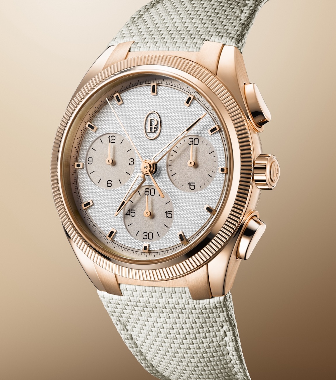
Exactly for the reason you suggested: now and then, we have to surprise our customers, yet doing it in the Parmigiani Fleurier way… So, high-tech materials are gaining popularity in the watchmaking industry. Now they account for around 11-12% of the value of the exports from Switzerland and they are very aggressive designs, usually; they are very bold. And so, we thought to bring our refinement to this segment, this category, and to offer Parmigiani Fleurier customers the pleasure of a high-tech material watch done the Parmigiani Fleurier way.
The choice of the material is really important because we would never have done watches in plain ceramic <the high-tech ceramic that we cover in the materials segment, this issue, not the kind in crockery – Ed>. We chose a material that had a luxury feeling, and this is a patented material that the supplier presented to me.
I got in touch with this material in 2018 for the first time. So, it’s something that I always looked at with interest. And this specific composition of cermet, which we call ultra-cermet to underline its technicality, has a particular capacity to reflect the light in a very powerful way. (As you have seen) it has a colour which is not black (though it might look it in pictures). It is grey and nuances of grey according to the light that is reflected.
If it is a cloudy day with a white sky or you are in a room with a white light, like if you are in the presentation room (at WWG), you would see it as very white, almost like metal. If it is a sunny day with a blue sky, you would see the blue reflected in the case (and the case will thus embody the ambience that it’s reflecting).
More on cermet shortly, but the colours you are playing with are exciting, and perhaps also surprising for a restrained brand. Tell us about the story here.
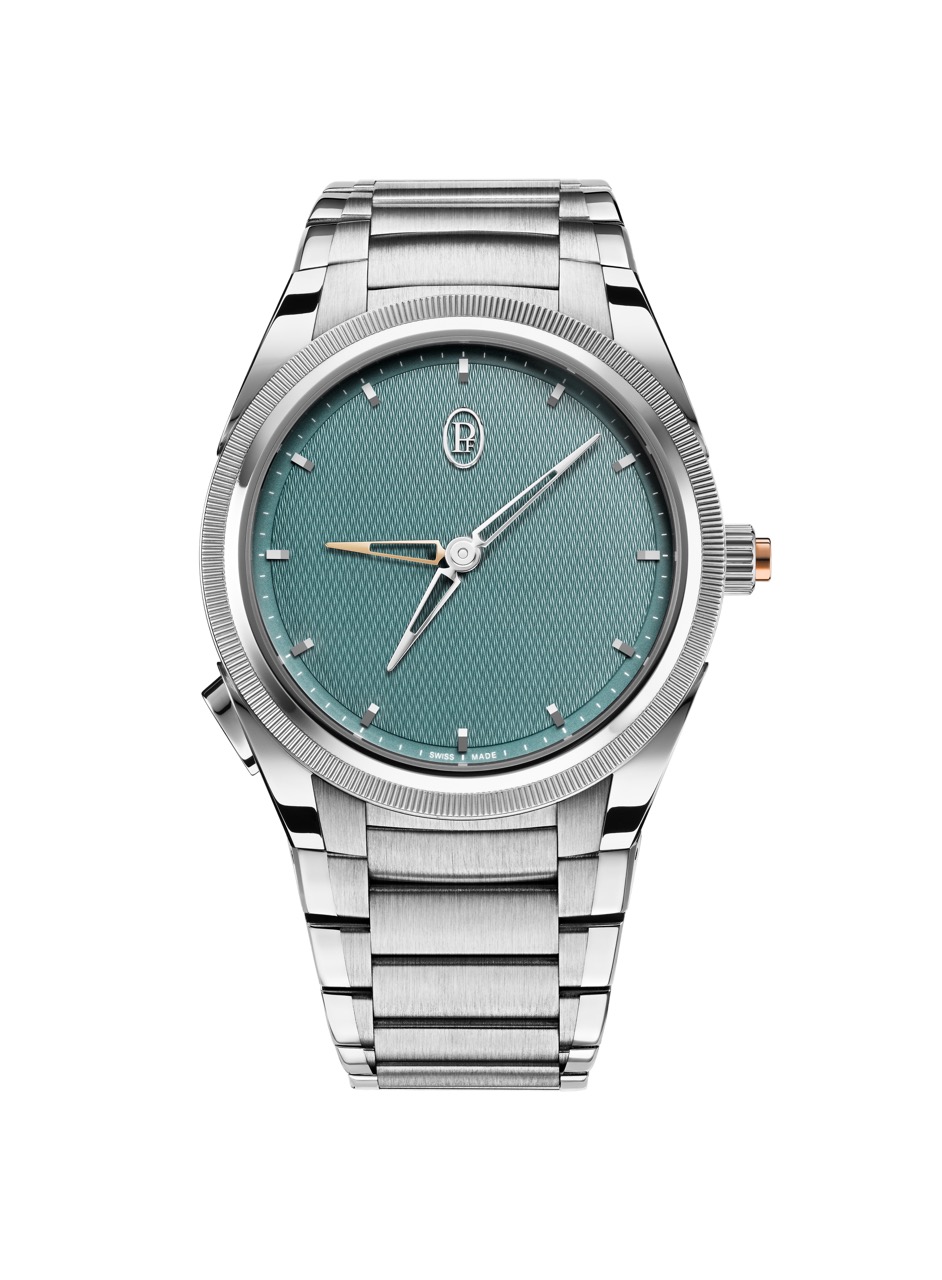
This intriguing colour transformation (as seen in the cermet material) is inherent in the brand’s identity; it is something that we like very much because in the end, it makes the product very lively. It’s also in our dials now when you have the sienna, the golden sienna, that according to the light can go towards a salmon (colour) or more of a sandy beige. It’s part of how we play with colours.
You mentioned the names of the colours <cut for space, but I called them cute, for the record – Ed> and it’s starting to become a problem because we are running out of creativity! (Kidding aside), we’re trying to underline (and define) the colour because there are so many nuances. Imagine, for example, (a customer) saying, “I want that green…” Yeah, but which green? So, you have to describe it in a way that you can recall.
In our catalogue, we always write the name and some names are (unusual) and a result of brainstorming. We try to have references either to nature or to a palette of colours like the Blue Milano, which comes from the sartorial world because it’s a suit’s colour, or the Verzasca, which comes from Valle Verzasca in Switzerland, where you have this beautiful river that has natural swimming pools; it’s not a luxury place. It’s just plain nature where people in the summer go to refresh themselves and dive into this beautiful water that’s between green and blue. This gave me the inspiration for one of my memories from when I was living in Como (on Lake Como in Italy).
You will never see a flashy colour (from us). Somebody asked me (also during the fair), Do you say no, sometimes, to certain requests? Of course, you say no because to build a brand identity, you have to be consistent. Somebody asked me a couple of years ago, can we do a special edition with a Tiffany blue dial? No, you go to Tiffany for a Tiffany blue dial! Of course, Patek Philippe can do it because they have a history there, but not us. So we said no to this request.
Backing up to the Tonda PF Sport in cermet, tell us about working with this material that you have never used before.
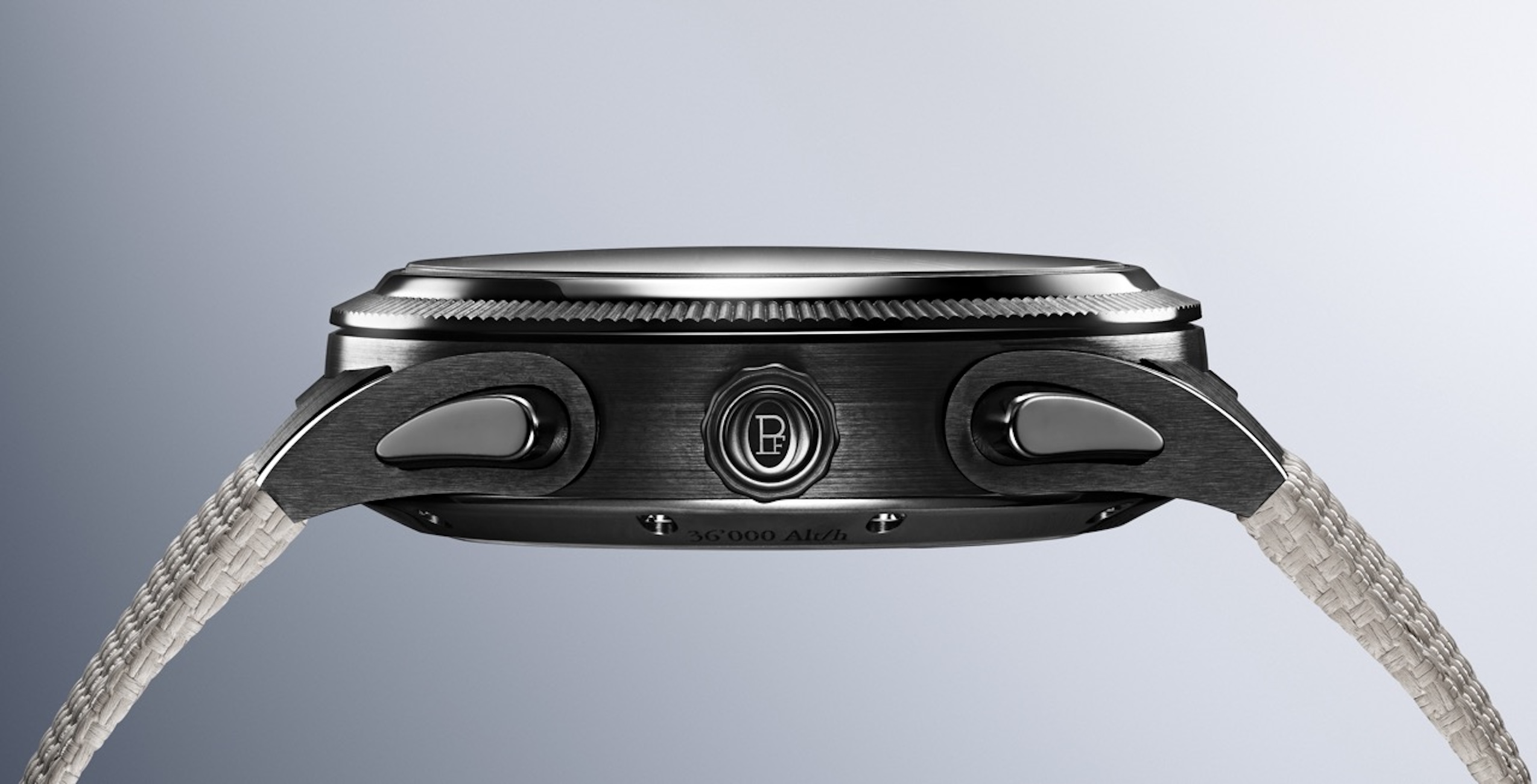
This (ultra cermet) was a challenge; it took us three years to develop the case because we wanted a full cermet case; it’s a world first. Nobody ever did a full cermet case <other brands have used some kind of cermet previously, most famously Omega, though never for elements such as the crown, bezel, pushers and the caseback. See the aforementioned materials segment for more – Ed> and it was possible because of the quality of the cermet that we chose. We challenged our supplier to respect the design of the Tonda PF Sport. To do so, we needed to do 14 different parts of ultra cermet to compose the design of the Tonda PF Sport. So that’s a challenge and very costly, but in the end, the result is in line with the philosophy of having a pure design. I’m very happy with the result. It’s being looked at with a lot of interest (since its debut).
From the first day of WWG, we had great emotional responses from our partners and the press.
Everything that is in the composition of the ultra-cermet is making or providing the metallic lustre effect that you see. So, you don’t have that colour because you have put paint in it. You have that colour because you have 38% of atoms of titanium in that composition. And then there is the process of finishing it because it is hard, but hard like regular cermet – yes, we have to have the brushings and polishings. These are all things that are done with diamond tools because these are the only ones able to affect this material, which is still extremely hard; it’s effectively un-scratchable. And so that is part of the beauty of the result. But without the specific composition of the cermet we use, you wouldn’t be able to have that effect.
Let’s return to those “emotions,” you mentioned when people saw the Tonda PF Sport. How do you build a product that can inspire such emotions because we saw it in the Tonda PF and the Toric too?
I think it’s a question of understanding the why of things. You have to go to the values of the brand and (the product, which embodies those values) has to intersect with a client that shares those values. The watch is like a wedding ring between the values of the brand and the values of the customer. And you have to know very well what the brand is; study the aesthetic codes of the brand; and study what is recognisable of the brand. But you have to then play with those elements with a lot of harmony and a lot of balance.
In the philosophy of the brand, there is this apparent simplicity; this purity of the style, which is driving everything we do. This means everything from the aesthetics to how we build a complication and how the experience of wearing the watch (feels). It has to be flawless; it has to be completely intuitive. And this you see with the GMT Rattrapante, which is a unique interpretation of the GMT, which is (also) extremely simplified.
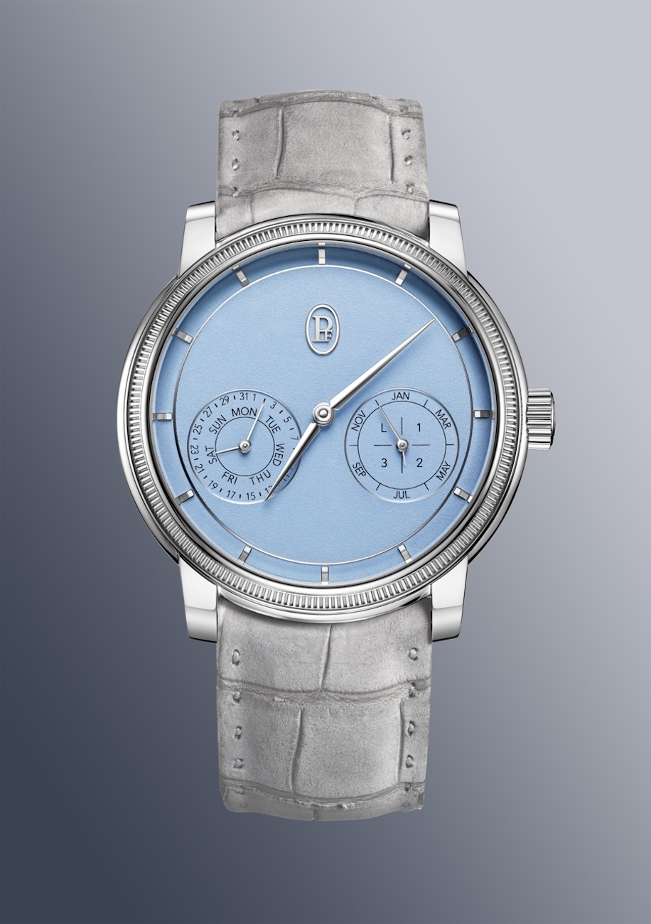
In (another example), the Toric perpetual calendar that I’m wearing, it is easy to read; it is the first degree of information, the hands indicating hours and minutes, that are always the protagonists (with the rest playing a supporting role). The display of the two (calendar) counters with the PF cartouche forms a perfect triangle that tells you that the geometry of the construction of the dial is very balanced…very serene.
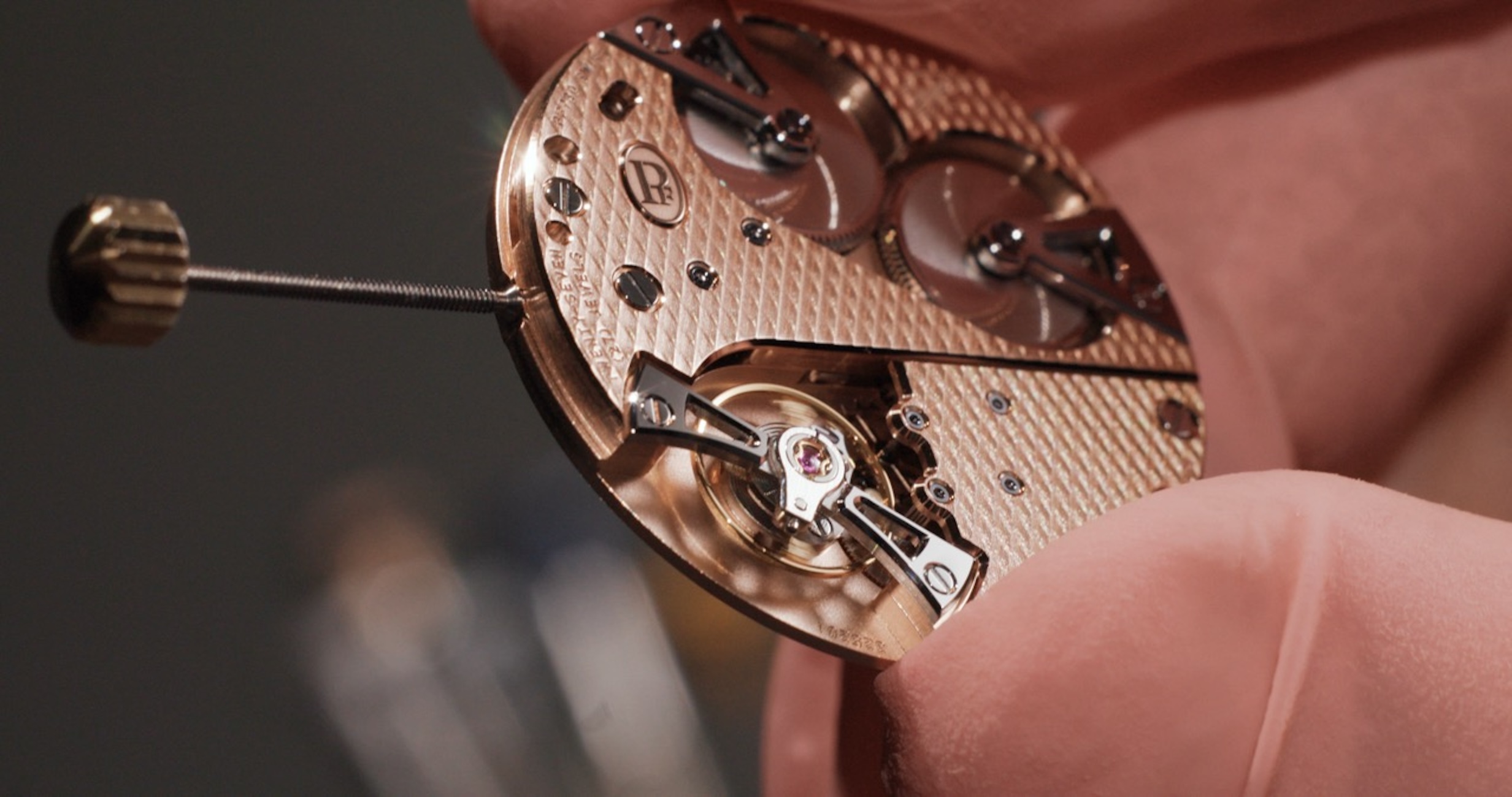
I love that because there is also the impression of a triangle in the movement… How does all this relate to technical mastery though, as evident in the new cermet model but also across the range? I am thinking here of the special curved dial of the Toric and, of course, grenage?
So, (what I mentioned earlier) are all sensitivities that are aesthetic but also technical because without the technique, you don’t get there. And then there’s the world of finishing because Parmigiani Fleurier is about superior finishing. This comes from Michel himself, from his life dedicated to restoration (of watches from) ancient times.
Finishings was a thousand times more (impressive) than today because we were living in a world driven by aristocracy. In the 18th century, there was no working class, so you didn’t have the need to be practical in your outfits and it was very Baroque in that period. Until the watch exited the pocket (and morphed into the wristwatch), the watch, even in the 19th century, remained attached to that aristocratic feel of an artistic and luxury object.
Today, the wristwatch has to fit in with the practicality of modern times, and so it evolves in that direction. So, you have a lot of things that you have to consider and the palette of colours is another one. When you design (for) a branded entity, you have to be consistent; you have to understand which are the ingredients that are coherent throughout the collection. When you are developing specific versions of any watch, whether it’s a complication, a skeleton, you have to be true to those principles.
The fact that we took out the logo in writing (substituting with just the symbol) is another important part of this creativity because the logo is for (observers, not oneself). Now it is more like an ellipse; it’s much more sophisticated, and much more subtle. So, these are all ways that we play with design, technique and watchmaking know-how; and there’s no magic rule otherwise everybody could do it! Luckily (for us), luxury is about sensitivity; it’s about education; and it’s about cultural references. That’s what builds the beauty of a style. The more educated the style, the more sophisticated it is and we try to serve that.
Read More: Why the Parmigiani Fleurier Toric Petite Seconde Is the Connoisseur’s Choice
Let’s wrap up with your thoughts on a legible design versus one that is striking.
Usually when it’s legible, it’s not striking! Because when you put too much into the design, you are overdoing it and probably you can be catchy, but then the design wears out on you. So, legibility and purity of design allow you to have a design that lasts longer. The icons of the industry, usually they’re all-time-only because that is just a less invasive design; it’s the most simple. But in the end, simplicity is the most difficult thing to achieve in design because you have to be true to the proportions. You have to be able to express something (complicated) with less complexity, so you have fewer ingredients to play with. And this is extremely important for us because that’s what we like to do. We like to simplify things for a very pure experience.
This story was first seen as part of the WOW #79 Summer 2025 Issue
For more on the latest in luxury watch reads, click here.
 English (US)